Cut and Paste Advertisement
What are your input factors? (What do you need to know or do before you can begin?) Include the research did you do and where?
We needed to know how to make an add that has line, color, emphasis, and balance.
Describe the process in detail. Explain the steps you followed in order to complete the project.
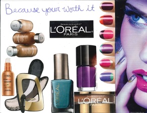
We looked through magazines and found adds that interested us. We used those adds for ideas in our own projects. We cut out things from different adds to compose into our own. I cut out Loreal products and pasted them to my paper. I also drew in with purple colored pencil “Because your worth it” their logo, in cursive at the top.
Describe the final output / product in detail: (what are we looking at?)
The final output of the project was an add that has color, line, emphasis, and balance. My final project was a loreal advertisement. It had nail polish, makeup and hair products incorporated into it. The logo “Because your worth it” is written at the top of the page. The finished result was posted on my Weebly website.
Describe feedback you received during the project (suggestions, comments, etc). From peers and the instructor. How did you use this feedback to correct issues with your project?
Our instructor told us to make it look very colorful and interesting, so I put in different colored pictures that really pop.
What did you learn during the assignment such as tools, skills, design concepts, software, hardware, etc. Where else could you use what you learned? How can you apply what you learned in other projects, areas, courses, assignments or outside school?
I learned about how hard it really is to make an advertisement even though it looks easy. A lot of thinking and planning goes into it to interest viewers. This could help you if you wanted to be in this profession some day or do something that has to do with advertisement.
If you were do the project again, what would you do differently and why? Provide reasons and examples
If I were to do this project again I would make my back round color paper instead of just white paper. If I were to do color paper for my backround it would make my add more colorful and pleasing to the eye.
What are your input factors? (What do you need to know or do before you can begin?) Include the research did you do and where?
We needed to know how to make an add that has line, color, emphasis, and balance.
Describe the process in detail. Explain the steps you followed in order to complete the project.
We looked through magazines and found adds that interested us. We used those adds for ideas in our own projects. We cut out things from different adds to compose into our own. I cut out Loreal products and pasted them to my paper. I also drew in with purple colored pencil “Because your worth it” their logo, in cursive at the top.
Describe the final output / product in detail: (what are we looking at?)
The final output of the project was an add that has color, line, emphasis, and balance. My final project was a loreal advertisement. It had nail polish, makeup and hair products incorporated into it. The logo “Because your worth it” is written at the top of the page. The finished result was posted on my Weebly website.
Describe feedback you received during the project (suggestions, comments, etc). From peers and the instructor. How did you use this feedback to correct issues with your project?
Our instructor told us to make it look very colorful and interesting, so I put in different colored pictures that really pop.
What did you learn during the assignment such as tools, skills, design concepts, software, hardware, etc. Where else could you use what you learned? How can you apply what you learned in other projects, areas, courses, assignments or outside school?
I learned about how hard it really is to make an advertisement even though it looks easy. A lot of thinking and planning goes into it to interest viewers. This could help you if you wanted to be in this profession some day or do something that has to do with advertisement.
If you were do the project again, what would you do differently and why? Provide reasons and examples
If I were to do this project again I would make my back round color paper instead of just white paper. If I were to do color paper for my backround it would make my add more colorful and pleasing to the eye.
Yard Sale Flyer
What are your input factors? (What do you need to know or do before you can begin?) Include the research did you do and where?
Before we could begin this project we needed to know how to make a flyer. We needed to make a flyer that stood out but was also pleasing to the eye and interesting.
Describe the process in detail. Explain the steps you followed in order to complete the project.
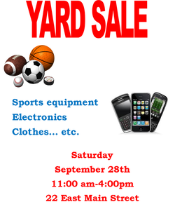
I chose a topic, which was a yard sale.
Describe the final output / product in detail: (what are we looking at?)
I put in the title in red for emphasis. Then I put the information and pictures.
The final output was a yard sale brochure. The yard sale items included sports equipment, electronics, clothes etc. The theme colors are blue and red and the pictures were of cell phones and sports equipment.
Describe feedback you received during the project (suggestions, comments, etc). From peers and the instructor. How did you use this feedback to correct issues with your project?
We were told to use the 1/3 rule so that helped making things organized within the flyer.
What did you learn during the assignment such as tools, skills, design concepts, software, hardware, etc. Where else could you use what you learned? How can you apply what you learned in other projects, areas, courses, assignments or outside school?
We learned how to make a flyer that is officient in grabbing the readers attention. This could help if you started some kind of business and needed to make flyers.
If you were do the project again, what would you do differently and why? Provide reasons and examples
If I were to do this project again I would choose different colors that work better together. Iwould probably choose maybe a light blue and dark blue that work better together.
What are your input factors? (What do you need to know or do before you can begin?) Include the research did you do and where?
Before we could begin this project we needed to know how to make a flyer. We needed to make a flyer that stood out but was also pleasing to the eye and interesting.
Describe the process in detail. Explain the steps you followed in order to complete the project.
I chose a topic, which was a yard sale.
Describe the final output / product in detail: (what are we looking at?)
I put in the title in red for emphasis. Then I put the information and pictures.
The final output was a yard sale brochure. The yard sale items included sports equipment, electronics, clothes etc. The theme colors are blue and red and the pictures were of cell phones and sports equipment.
Describe feedback you received during the project (suggestions, comments, etc). From peers and the instructor. How did you use this feedback to correct issues with your project?
We were told to use the 1/3 rule so that helped making things organized within the flyer.
What did you learn during the assignment such as tools, skills, design concepts, software, hardware, etc. Where else could you use what you learned? How can you apply what you learned in other projects, areas, courses, assignments or outside school?
We learned how to make a flyer that is officient in grabbing the readers attention. This could help if you started some kind of business and needed to make flyers.
If you were do the project again, what would you do differently and why? Provide reasons and examples
If I were to do this project again I would choose different colors that work better together. Iwould probably choose maybe a light blue and dark blue that work better together.
Black and White Flyer
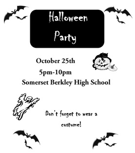
We had to make a black and white halloween themed flyer. I did a halloween party. It was hard to make it black and white because color can be a big part in making emphasis. There are other ways you can make emphasis like shapes and certain fonts. It was also difficult to find black and white images. You cant use gray scale because that still uses different shades. I chose pictures that were already black and white so I didnt have to cange them. I made the title have emphasis by creating a black rectangle around the title and making the text white.
We had to make a black and white halloween themed flyer. I did a halloween party. It was hard to make it black and white because color can be a big part in making emphasis. There are other ways you can make emphasis like shapes and certain fonts. It was also difficult to find black and white images. You cant use gray scale because that still uses different shades. I chose pictures that were already black and white so I didnt have to cange them. I made the title have emphasis by creating a black rectangle around the title and making the text white.
Tri-Fold Brochure
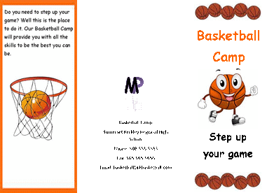
Page 1 This assignment was to make a tri fold brochure. We could make it on whatever we chose. I chose a basketball camp because its my favorite activity. This is the first page of my brochure. It has the tite of the event, the slogan or catch phrase, the information page and a page that describes what it is without giving too much away. I chose pictures that had to do with basketball because it is a basketball camp. The information page has the address, phone number, and email. I also made a symbol using my initials with word art.
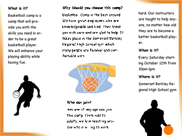
Page 2 This is my second page of my brochure. This page has all the information that a costomer would need. I put what it is, why they should choose the camp, who can join, when is it, and where is it. I also put pictures to give the readers eyes a break between text. The last thing I did on the second page was linked two text boxes togther.
Thayer Street Brochure
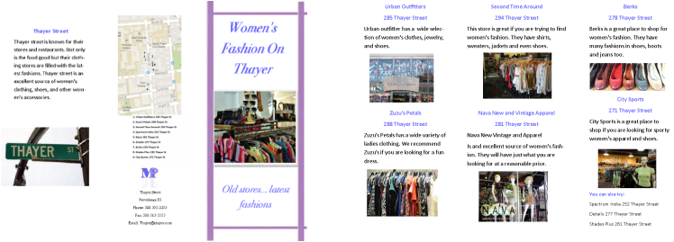
The project was to make a brochure about Thayer Street on the topic that was chosen for each group. Each group needed to know how to make a brochure; they had to go to Thayer Street and Research their topic, which was woman’s fashion. They took a field trip to Thayer Street, Providence RI. The group found all the woman’s fashion stores and recorded them. They also made a map of the stores. The following day they proceeded to make a brochure using the data from the field trip. The final output was a tri- fold brochure. The stores included Urban Outfitters, Zuzu’s Petals, Second Time Around, Nava New and Vintage Apparel, Berks, City Sports, Spectrum India, Details, and Shades Plus. Feedback the group received was to make a small list of stores to also visit because there wasn’t enough room to put info and a picture for every woman’s fashion store. During this assignment they learned how to take information, like woman’s fashion stores, and turn it into a brochure that is interesting and pleasing to the eye. If they were to do this project again they would probably choose a different theme color that is brighter and stands out.
